How To Prioritise - Part II
 I recently posted an entry on my blog about how to prioritise quickly and intuitively.
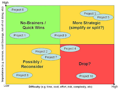
I presented a 2d matrix with importance (business value) on one axis and difficulty (effort/complexity/cost/risk) on the other.
It's a simplistic approach, but then that's what I like about it. Simple beats complicated any day!
And I also like the fact it helps people like me to visualise priorities.
Anyway, Scott Selhurst from Tyner Blain has extended this concept brilliantly.
In summary, Scott's idea is to make this approach more quantitive, so the output is a physical order of priorities and not just a graph for visualisation purposes.
Plot the importance/business value axis using points, rather than just a position based on relativity. Score importance 1-10, or 1-100 if you want more granularity, whatever you prefer. Plot the difficulty/effort axis also using points. If you're estimating using complexity points or the Fibonacci index, for instance, use this.
As well as giving you the graph above, Scott then shows how you can calculate a value:effort ratio for all the things in your list of priorities. This ratio, being a number, allows you to put your priorities in order. And in an order to deliver the highest value fastest, rather than just highest value first.
To read Scott's article, see here: Prioritisation and Value Maximisation.
See also:
How to prioritise quickly and intuitively
10 Key Principles of Agile Software Development


25 August 2007 08:47
Hi Kelly
What I find interesting about your prioritisation matrix is that if you draw a 1/x curve through it, you pretty much describe the long tail.
22 November 2007 13:17
I don't see how the axes on this matrix correspond to the long tail. When you draw 1/x on any set of axes it looks like the long tail, is that what you mean?